Typography
Typography
We use the same guidelines and typeface as UNOPS. Our body font is Open Sans, and our display font is VF Sans.
Body font: Open Sans
Most type — such as flowing body text, seconday text and metadata, and user interface elements — should be set in Open Sans. A simple, highly legible “humanist” sans-serif, Open Sans has a solidity and clarity to its design that reflects our values of trust and transparency.

How to obtain Open Sans
Open Sans is freely available through Google Fonts under an open-source license. Download it here.
Display font: VF Sans
Headlines and subheadings should be set in VF Sans. A commercial grotesque-style font, VF Sans has the strong, understated clarity of midcentury classics like Futura but feels slightly more casual and friendly due to its quirky, more stylized design.

How to obtain VF Sans
VF Sans is a proprietary, commercial font available through Terminal Design. Licenses must be purchased by “seat” (individual device) for print and collateral use, and as a “webfont” for use on websites. Contact your manager if you need access to UNOPS’ license.
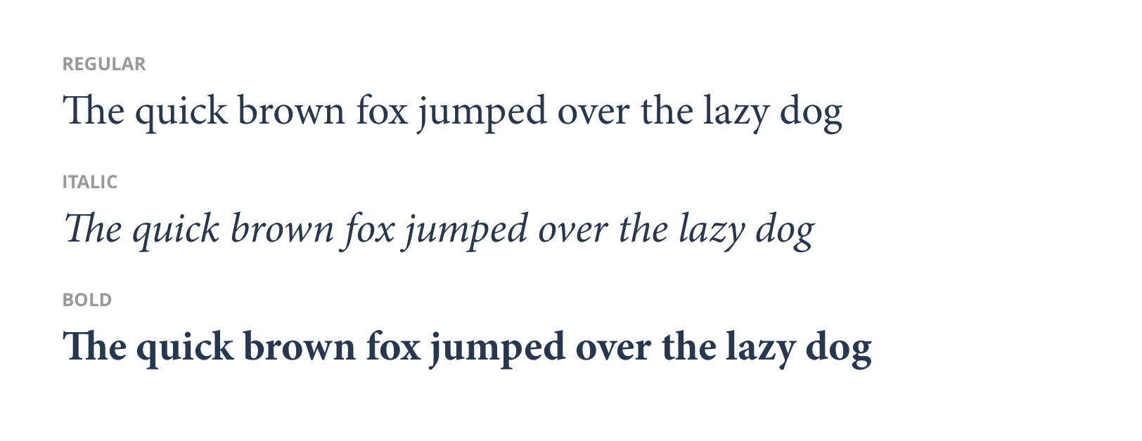
Legal font: Minion Pro
For official legal documents that IAIG produces, we use Minion Pro.
How to obtain Minion Pro
Minion Pro is a proprietary, commercial font available through Adobe Fonts. Licenses must be purchased by “seat” (individual device) for print and collateral use, and as a “webfont” for use on websites. Contact your manager if you need access to UNOPS’ license.