IAIG’s logo
Download all logo files
IAIG’s logo
Our logo adapts elements from the UNOPS brand (such as the brand fonts and colors). Its goal is to define IAIG as an independent unit within UNOPS. While the IAIG logo is distinct from other UNOPS groups, its position within UNOPS must be referenced at all times.
While several variations are available (see below), we should use this version whenever space allows, because it includes all the important style elements in one lockup.
Construction
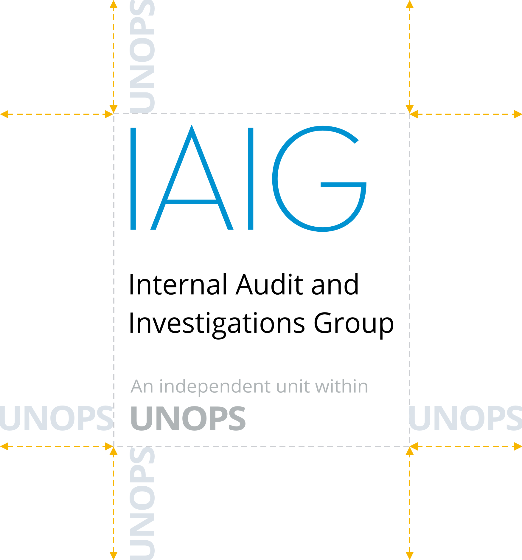
Our logo uses the IAIG acronym (set in UNOPS’ VF Sans typeface) as its primary element. Below is our full name, and a description of our relationship to UNOPS (both set in UNOPS’ Open Sans typeface).
Note that these elements have been carefully placed to work together as a single unit in as many contexts and sizes as possible. Do not attempt to reproduce the logo yourself or to rearrange the elements.
Spacing
The space around the logo should be equal to (or greater than) the width of the “UNOPS” acronym.
Color
The logo is available in three color variations:
- Positive: A full-color version for use over light backgrounds. Here, the emblem is blue while the logotype is black.
- Grayscale: A black-and-white version for use over light backgrounds. The emblem and logotype are black, while the “UNOPS unit” text is gray.
- Reverse: A version for use over dark backgrounds. The emblem and logotype are white. Can be used in either full-color or grayscale contexts.
The logo is designed to be used over solid-color backgrounds (preferably in brand colors). Do not place the logo over images, patterns, or other busy backgrounds.
In compliance with WCAG 2.0 Accessibility guidelines, the logo and its background should always have a contrast ratio of at least 3:1. You can check the contrast ratio using WebAIM’s Contrast Checker tool.
Horizontal lockup
We use the “stacked” lockup by default. An alternate, “horizontal” version is available, however, for exceptional cases where space is tight and the default lockup does not fit.
The horizontal lockup is also available in 3 color variations: positive, grayscale, and reverse.
Co-branding
Our logo should not be used for co-branding purposes. Instead, use the UNOPS logo.
Using the logo
- Do not attempt to reproduce the logo. Use the logo files available for download in this guide.
- Do not type out any portion of the IAIG logo in any other fonts.
- Do not stretch or manipulate the logo.
- Do not use any other colors for the logo than those provided in this guide.
- Do not place the logo over a busy or patterned background.
- Do not pair the logo with marks that may be confused as logos.
For examples of the logo in application, see the In use section.
Sizing
Do not shrink the logo to a size smaller than these minimums:
- Screen: 100 pixels / 6.25 rems wide
- Print: 35 millimeters / 1.4 inches wide
In general, the logo must be scaled so that the smallest text in the lockup is clearly legible.
UNOPS logo placement
The IAIG and UNOPS logos should not be placed side by side.
If the document or communication is presented primarily by UNOPS, use only the UNOPS logo.
If the document or communication is presented primarily by IAIG, use both the IAIG and UNOPS logos. The UNOPS logo should be placed separately from the IAIG logo.
Summary
- Use the “stacked” lockup in most cases. Use the “horizontal” lockup only when the “stacked” version does not fit the available space.
- Always show the relationship with UNOPS.
- Do not place the UNOPS logo next to the IAIG logo. When both are used, the UNOPS logo should be clearly visible but standalone.
- When in doubt, use only the UNOPS logo.